
The first thing you will see after signing in is the Map.
But what does it actually do or what is it good for?
Once you will sign in you will see the country of your residence (can be set in your profile) in the centre of the screen.
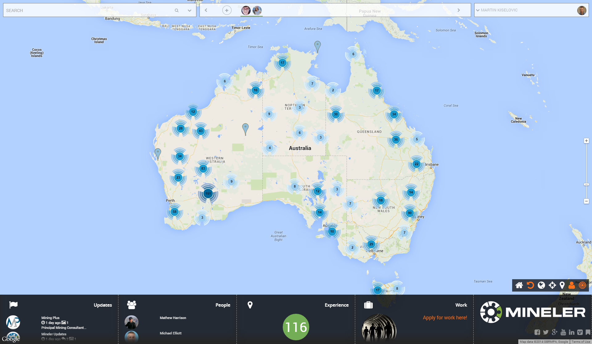
The blue clusters on the map represent grouping of the pins (locations/ projects) in that country.
OK I get it , but why do they have different colours? It is for distinguishing visually the amount of pins in the area:
1. Light blue clusters = one digit number of pins
2. Medium dark blue clusters = two digit number of pins
3. Dark blue clusters = three digit number of pins

If you like pins better you can deactivate clusters on the map by clicking on the clusters icon.
See more about map action icons here.

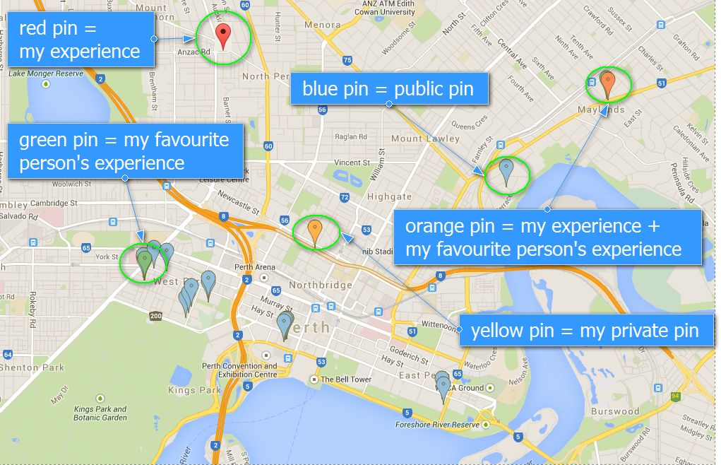
Now you understand the colour of the clusters but what about the pins?
Simple as that:
1. Blue = Public pin
2. Red = My pin
3. Green = Pin with my favourite person(s) experience
4. Orange = Pin with my experience + my favourite person(s)
5. Yellow = My private pin that I am editing at the moment (pin dropped on the map by myself)
Now you’re ready to work with the map!